Rapid Pages: Enhancing User Experience with New Website Components
Creating new components for your website can greatly enhance user experience and engagement. Rapid Pages offers creative prompts to inspire and guide you in designing components that are both visually appealing and functionally effective. Whether you’re looking to craft a compelling Call to Action (CTA) for your landing page or detailed product cards, this guide will help you conceive and execute your vision.
Designing a Compelling CTA for Your Landing Page
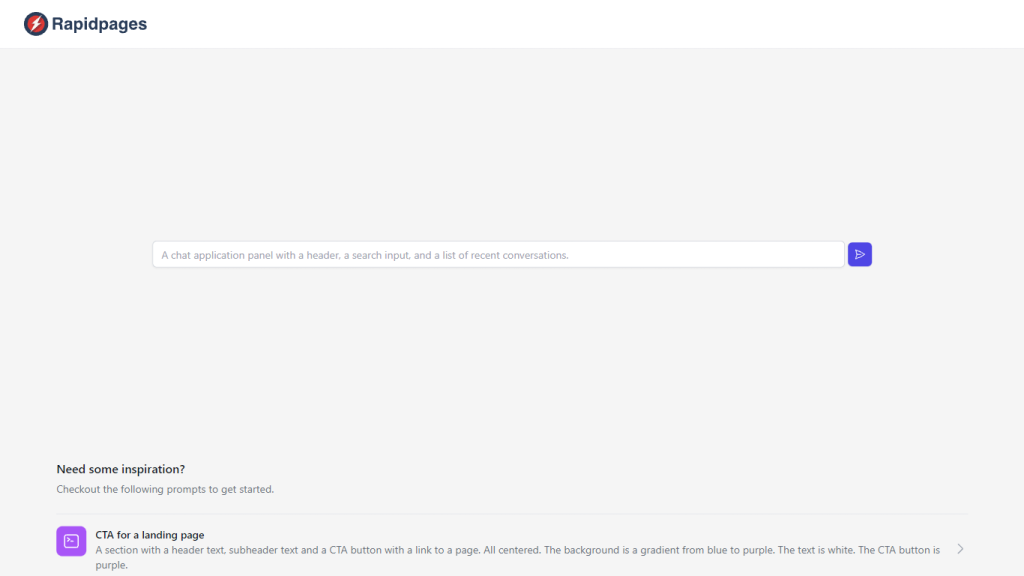
For a landing page CTA that grabs attention, imagine a section with a bold header text, a captivating subheader, and a prominent CTA button that links to a pivotal page of your website. This component is designed to stand out with a stunning background gradient transitioning from blue to purple, while the text remains a crisp white for readability, and the CTA button follows the theme with a deep purple hue.
Showcasing Product Features with a 2×2 Grid Layout
If you want to showcase the features of your product, our layout suggestion includes a section with clear header and subheader texts above a centered 2×2 grid. Each grid cell succinctly describes a key aspect of your product against a subtle gray background, with text in white to ensure clarity and focus.
Neatly Arranged Product Cards with a Clean White Backdrop
Our product card proposal entails a neatly arranged section with two cards at the center, spotlighting the product image, name, description, and a purple CTA button on a clean white backdrop. We recommend using black text to offer a strong contrast, facilitating an effortless reading experience.
In summary, Rapid Pages provides creative prompts to help you design visually appealing and effective website components. These components can greatly enhance user experience and engagement, ultimately leading to higher conversion rates and increased revenue for your business.


